 |
|
|
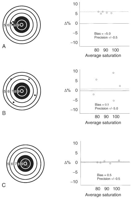
Figure 30-2
Accuracy and precision. The bias plot is a way to compare
two different methods of measuring the same variable. Examples are plotted above
on the right for saturation values, blood analysis versus pulse oximetry. It is
a plot of the difference between the two measurements being compared versus the average
of those two measurements. If one method constantly measures slightly higher than
the other by a consistent value, it has a positive bias. If it has only slight variation
around that bias, it is said to have very low random error (or precision, which equals
the standard deviation of the differences) (A). B,
The values are randomly scattered such that the average difference is near zero,
but the precision value is very large. This large random error makes the device
unusable because calibration will not improve this random error. C,
The optimal device, that is, a bias near zero and a very small precision (standard
deviation of the differences). No amount of calibrating or "sighting in" could cause
B to become more accurate because the error is randomly
scattered.
|
|