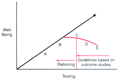
Figure 25-4
Theory and actuality of what happens to well-being as
testing increases. The straight line represents the common theory that "the more
testing, the better"; that is, that well-being increases with testing. The A-to-E
curve shows what actually happens as testing increases. At a certain point (point
C), more harm than good may result. Therefore, point C represents the optimal point
in the well-being versus testing relationship. The goal of using guidelines is to
direct resources from point E to point C (to reduce testing and to increase well-being).
Unless health-care providers allocate health resources in a cost-efficient manner,
governmental restrictions will move testing from point C to point A—that is,
will ration testing that improves well-being.